Sailing forward with the visual identity of belonging and resistance
Tallinn, Estonia
Client
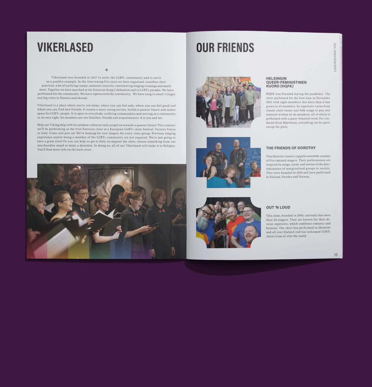
Vikerlased LGBT+ Choir
Mission
To revamp Vikerlased’s visual identity with better structure and symbolism while preserving its emotional roots. Then, to create a memorable visual campaign for their fifth anniversary concert celebrating pride, heritage, and progress.
Outcome
A refined identity system that honored the original mark while introducing clarity, typographic unity, and layered symbolism. Followed by a distinctive concert campaign, “Legendaarne Viis,” which drew from Estonian folklore to celebrate queer visibility and historical resilience.
Impact
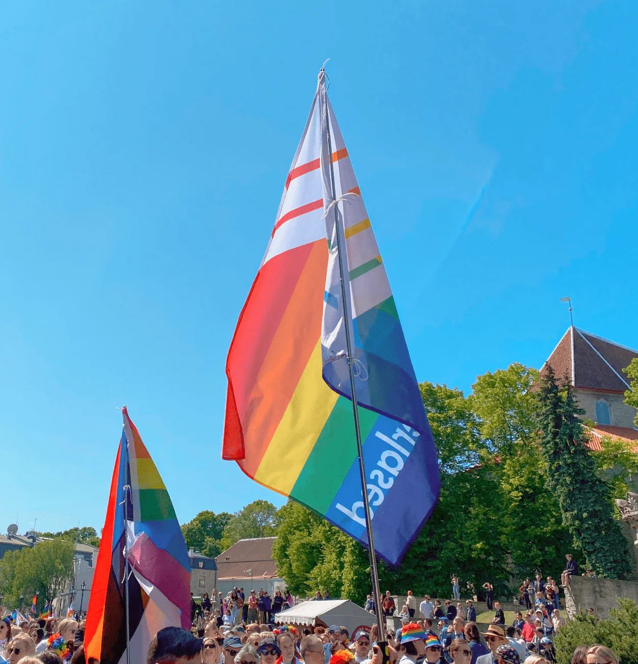
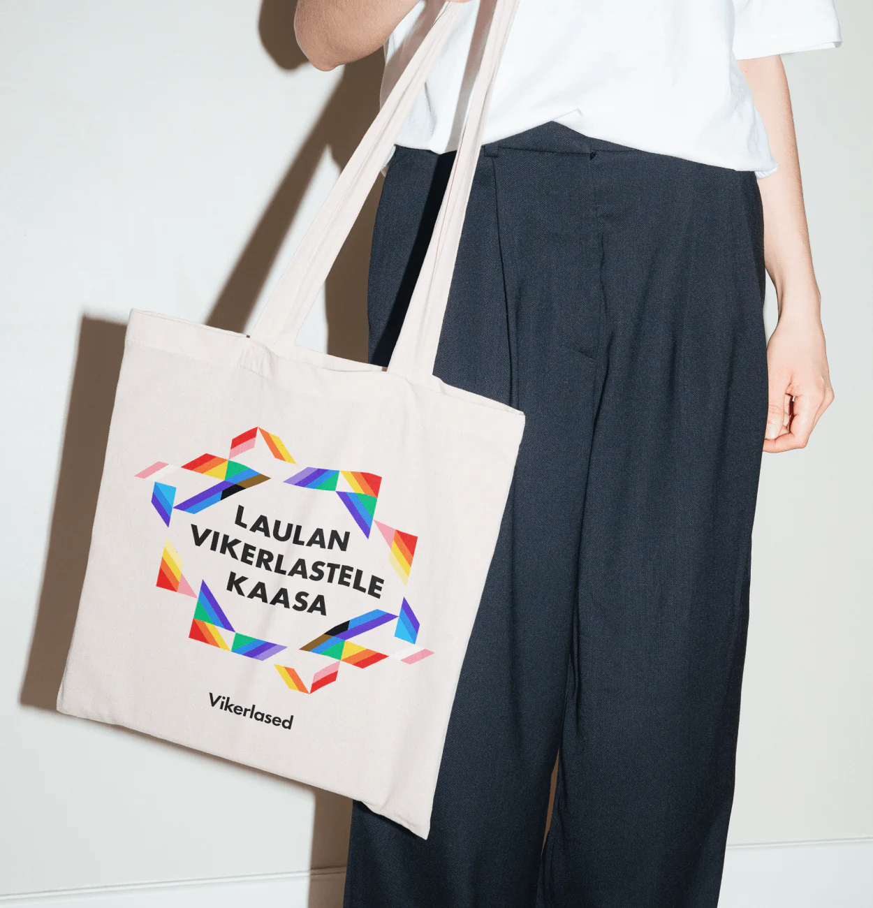
The updated identity was embraced by the choir, used across social media, apparel, and event materials. The concert reached full capacity and helped generate funds through limited-edition prints, becoming both a cultural and visual milestone.
Services
Visual Identity Design, Logo Refinement, Illustration, Brand Applications, Poster Design, Social Media Templates, Apparel and Flag Design, Digital Design
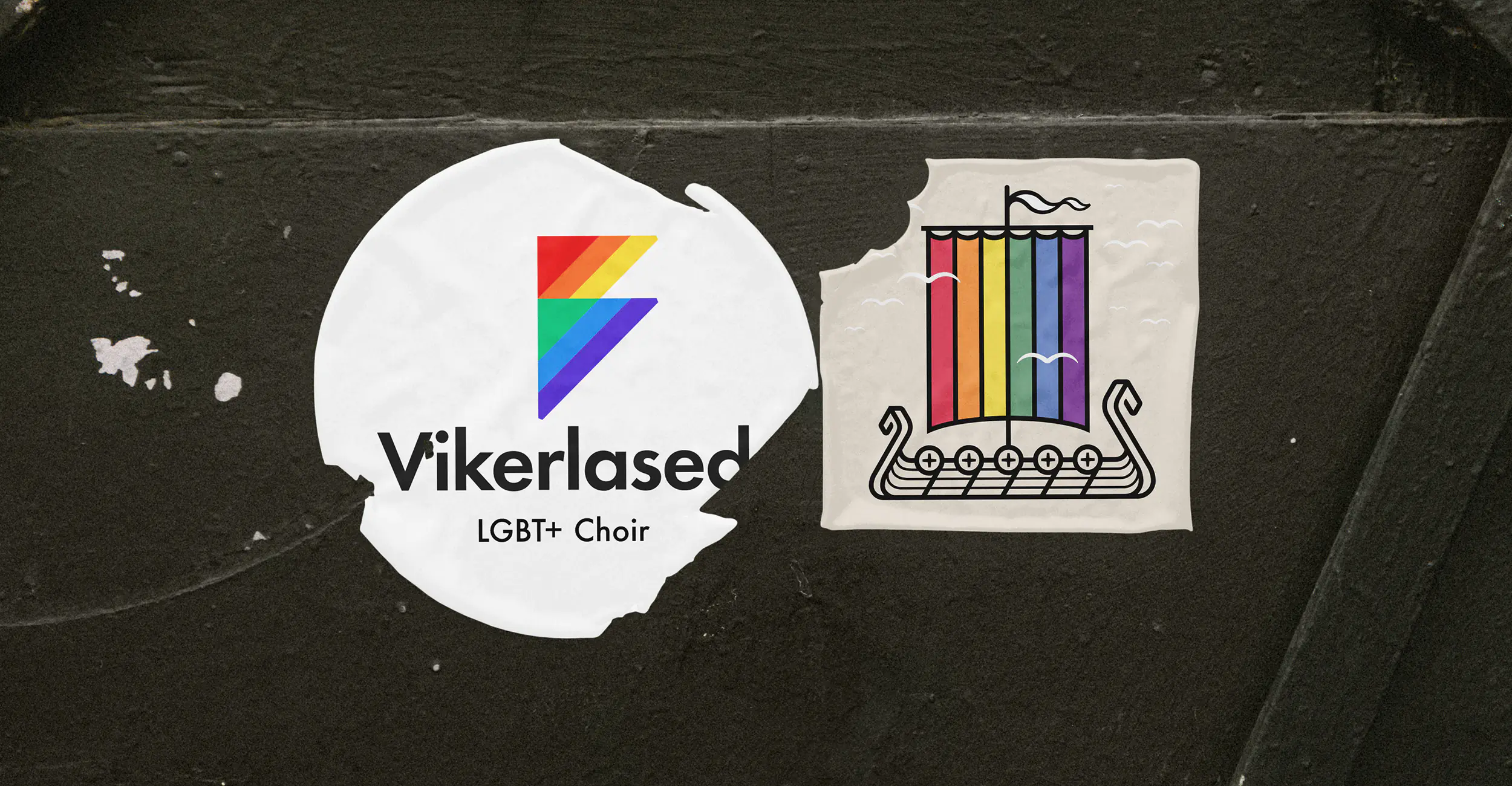
Vikerlased is the first LGBT+ choir in the Baltics, recognized for performances at prestigious venues such as the Estonian Song Festival (Laulupidu), the European Various Voices Festival, and the GALA Festival in the United States. Their name, derived from the first Estonian opera, translates to "Rainbow Vikings”.
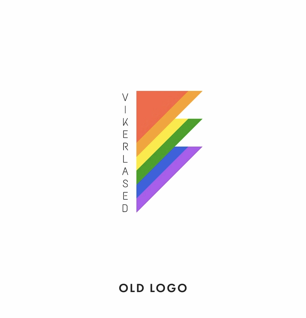
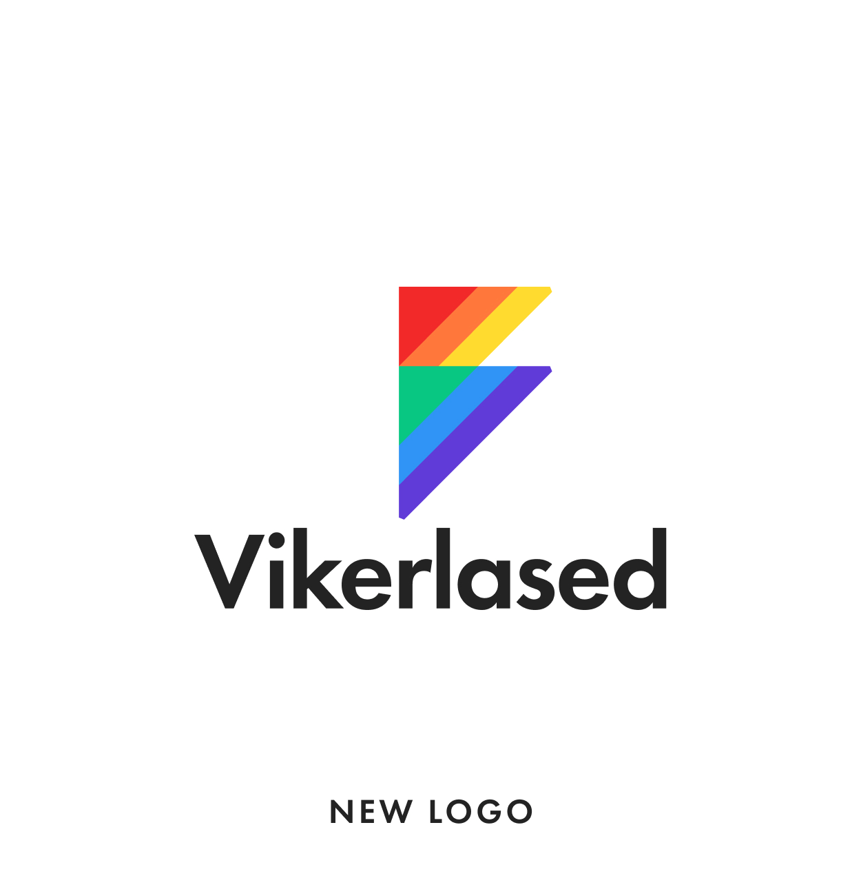
When Vikerlased’s leadership approached us, the challenge was clear: update their logo without alienating long-time audiences and members who held deep emotional attachments to the original. Created by a former choir member, the existing mark carried meaningful history. Our task was not to redesign from scratch, but to elevate it, bringing structure, integrating symbolism, and cohesion while respecting its roots.
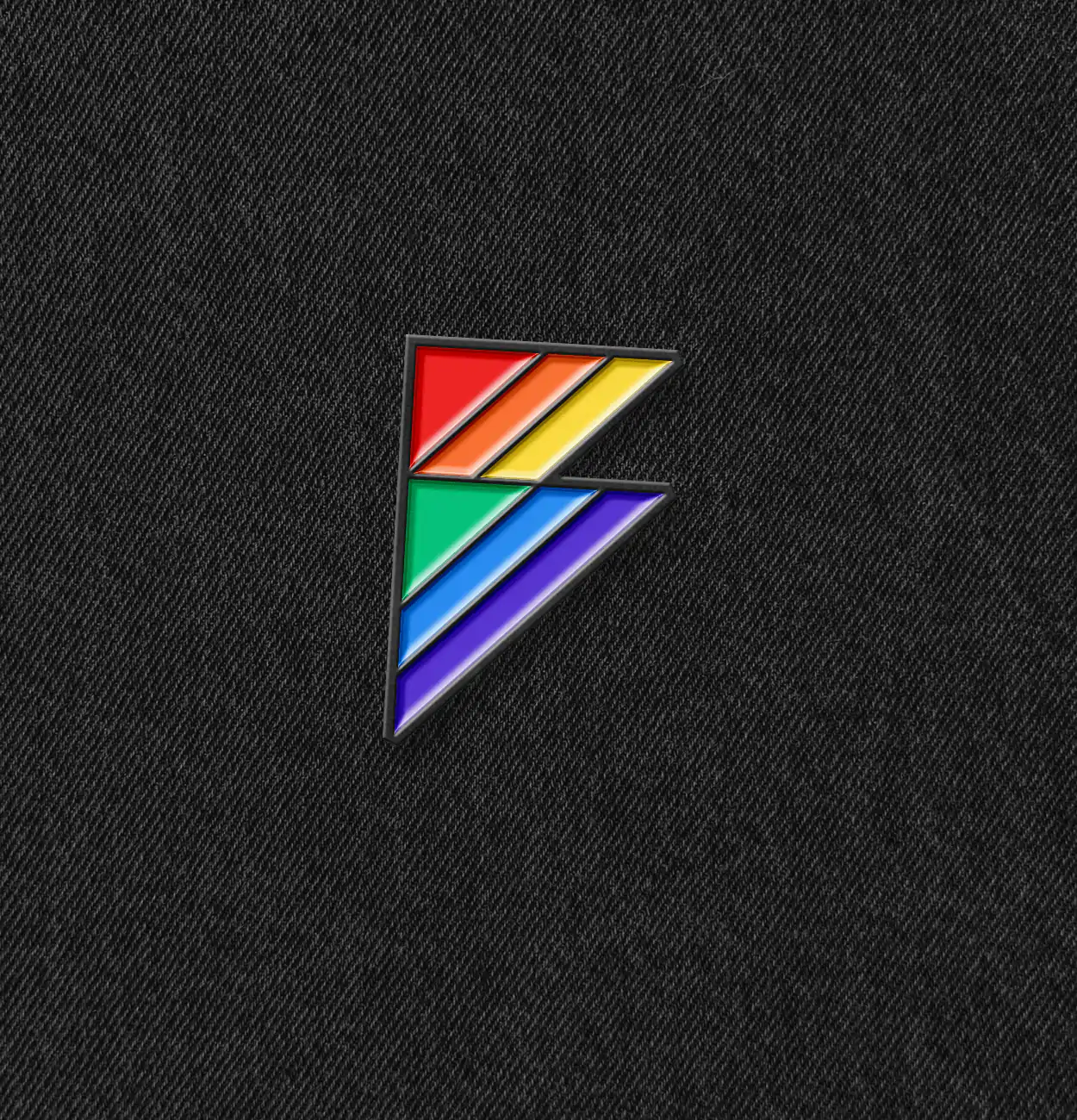
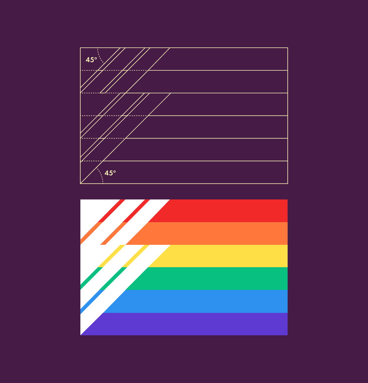
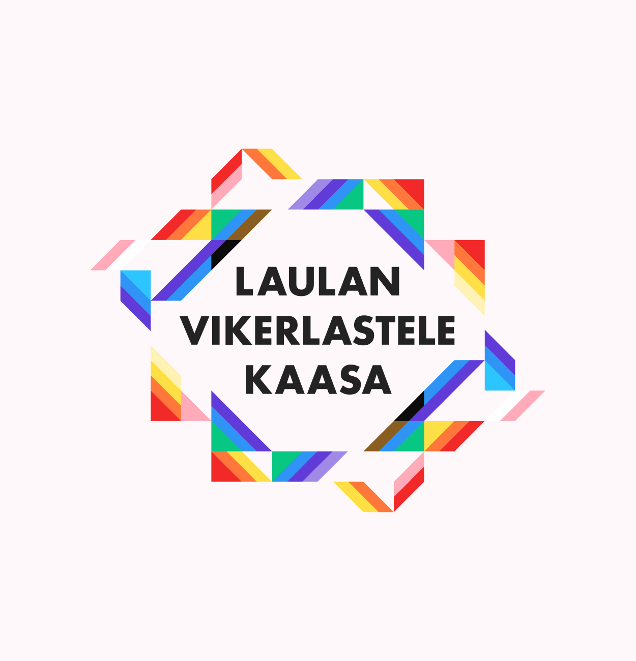
We began by identifying the key visual and cultural touchpoints embedded in the choir’s identity. The revised design was built on a rational grid inspired by musical staff lines. We introduced visual metaphors that layered meaning: triangles as symbols of queer resistance; “V” and “B” shapes for “Vikerlased" and
“Baltics first”; six-color rainbow for pride. The symbol together with the typography form a Viking ship to represent resilience and heritage.
Initial reactions were cautious. Some members questioned the need for change. To honor those sentiments, we introduced the updated identity gradually, integrating it across platforms without disruption. The result was seamless enough that one member later asked when the new logo would be launched, unaware it was already in use.


No items found.

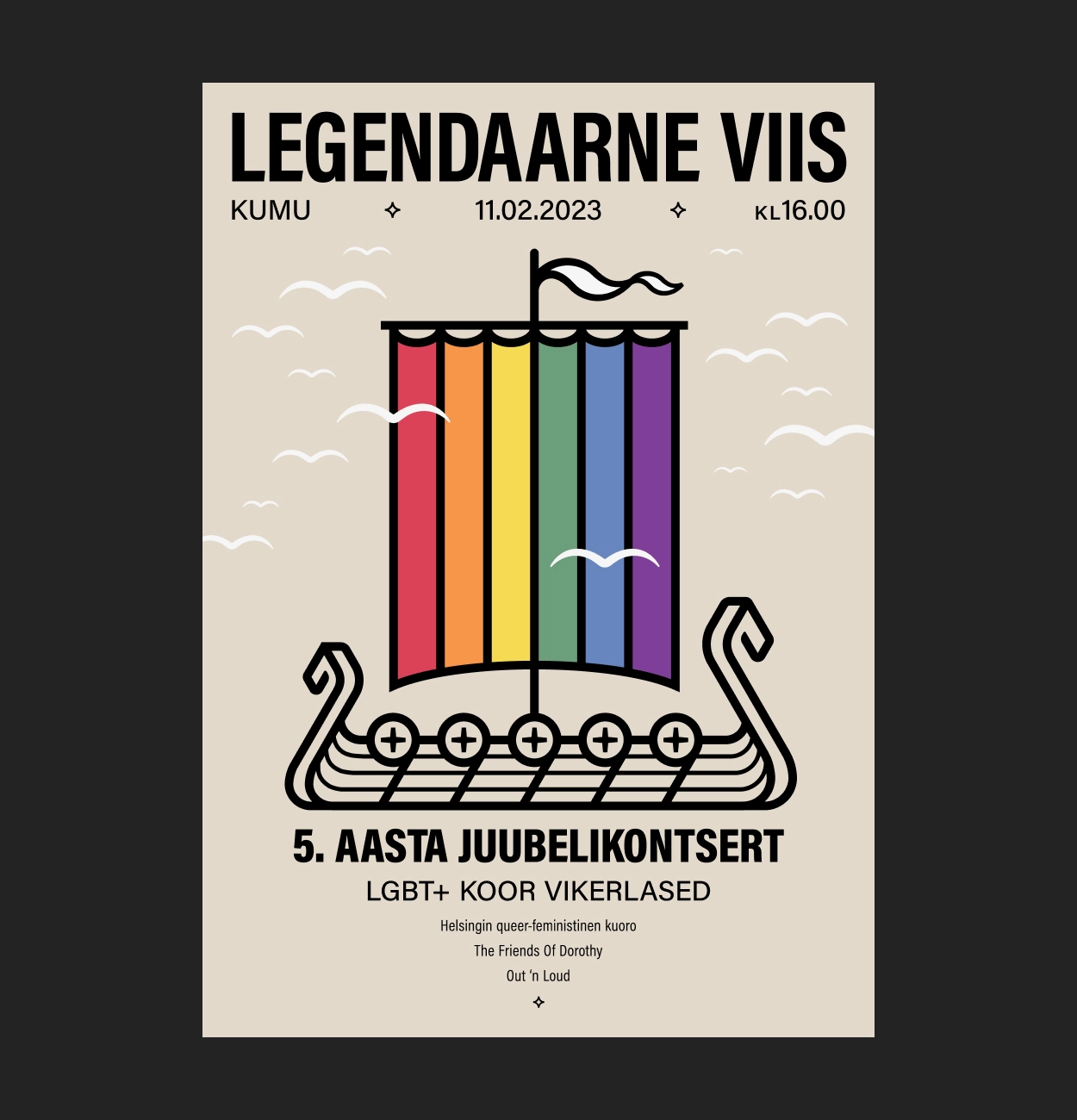
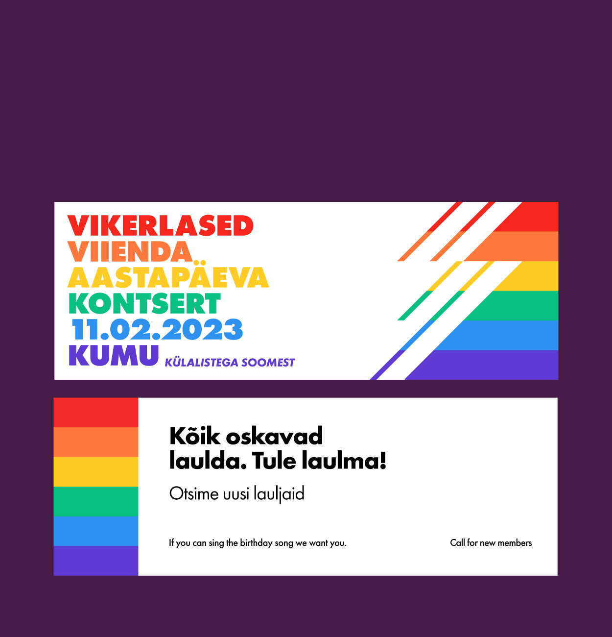
The second phase of the collaboration involved the visual campaign for Vikerlased’s fifth anniversary concert, "Legendaarne Viis," hosted at the KUMU Art Museum. The concert was more than a celebration; it was held during an active national conversation on marriage equality, making it both timely and symbolic.
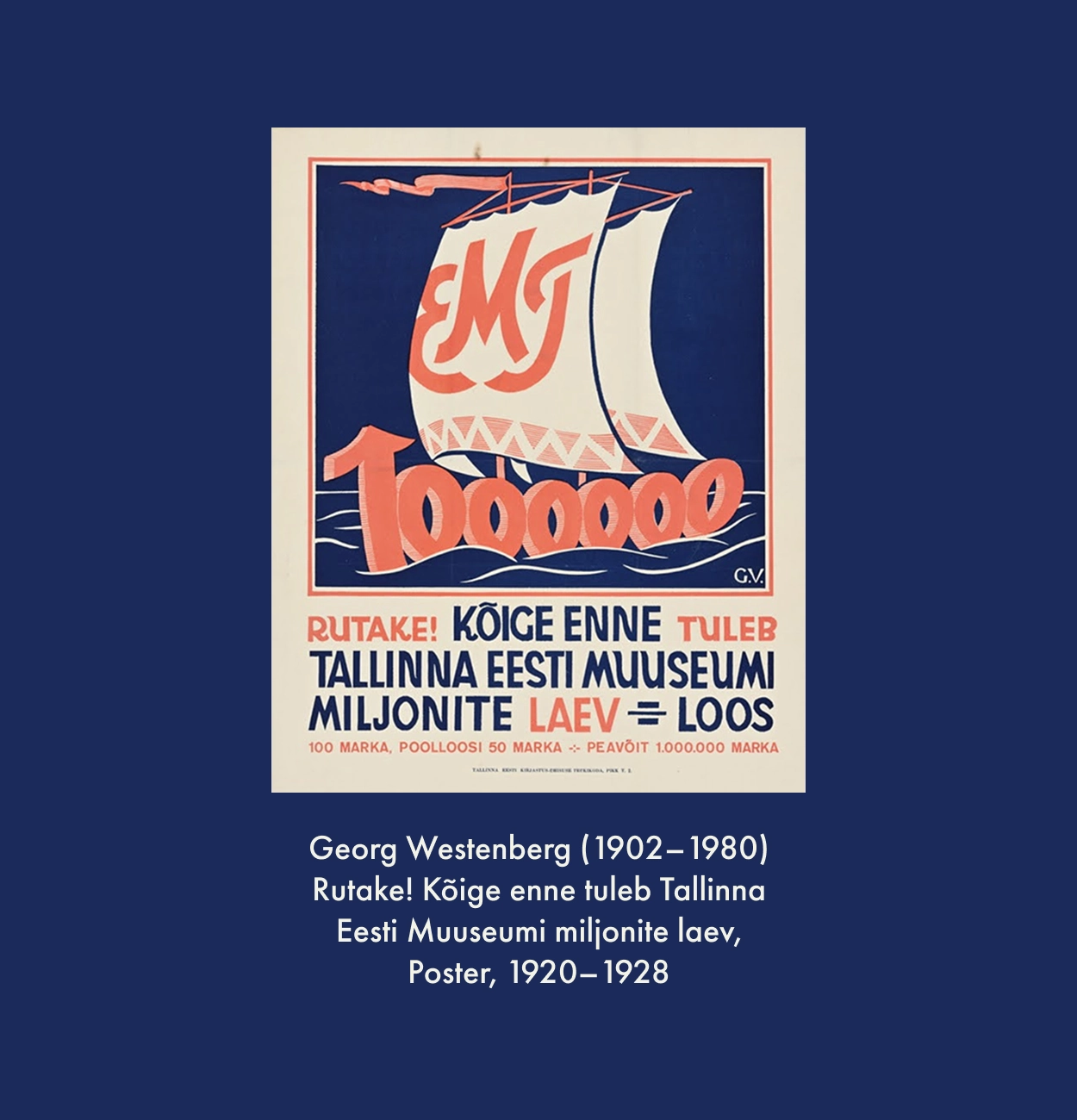
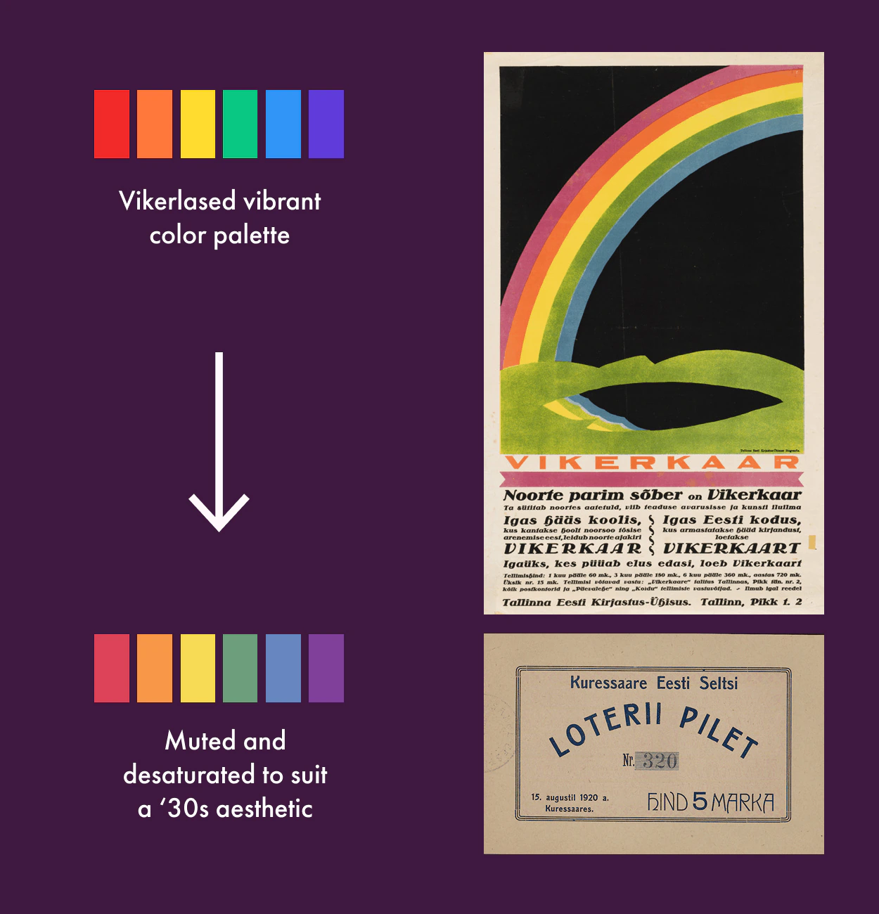
We approached this campaign with a deliberately distinct aesthetic. We lent elements from 1930s Estonian graphic design, Heiti Talvik’s poem "Legendaarne," and the national legend of the white ship, a symbol of collective hope. We developed a visual centerpiece: a Viking ship with rainbow sails. This image bridged Estonia’s cultural folklore with a contemporary call for inclusivity, reinforcing the continuity between the choir’s identity and the concert’s message.
The campaign was met with enthusiastic reception. The concert sold out, and the poster became a meaningful artifact for supporters. Just weeks later, Estonia passed marriage equality legislation.
Design doesn’t legislate. But it does shape narratives. For Vikerlased, the refreshed identity and commemorative campaign provided a unified voice, a way to be not just seen, but clearly recognized. Together, we created a visual language that was both respectful of history and rooted in the queerer future.

No items found.