Designing for connection, credibility, and care in Children’s Mental Health
Nicosia, Cyprus
Client
Stella Hadjimichael, child psychologist
Mission
A visual identity that reflected Stella’s personal style and approach, without relying on the usual mental health clichés.
Outcome
We developed a visual identity based on her initials, incorporating playfulness, and psychoanalytic concepts, themes that are very much a part of work with children in therapy.
Impact
There is a new identity that has been established as a reputable presence within the community to help Stella spread awareness and build confidence within a community that still widely misunderstands mental health.
Services
Visual Identity, Logo Design, Brand Strategy, Brand Applications, Print Design, Social Media Templates
In the suburbs of Nicosia, open conversations around children’s mental health are just beginning to happen. Stella Hadjimichael is helping lead that shift. As one of the area’s first practicing child psychologists, she’s doing important work. She needed a visual identity that could reflect that depth without relying on therapy clichés.
When Stella approached, she needed more than a logo. She desired to communicate professionalism and be approachable. Her brief was broad but specific in one way: she did not wish to have something that was clearly “child therapy.” It needed to be abstract, perceptive, and powerfully subtle.


No items found.


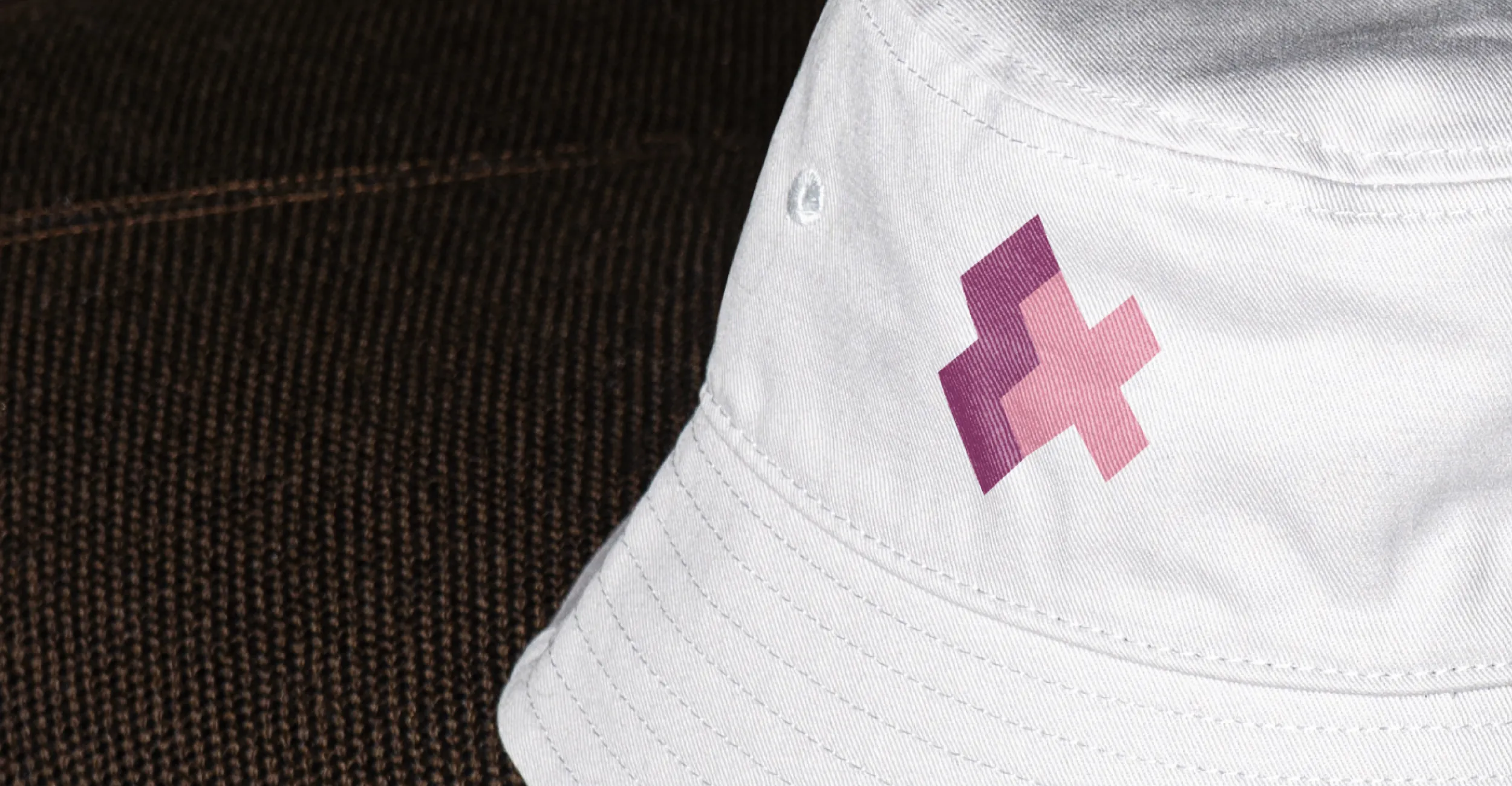
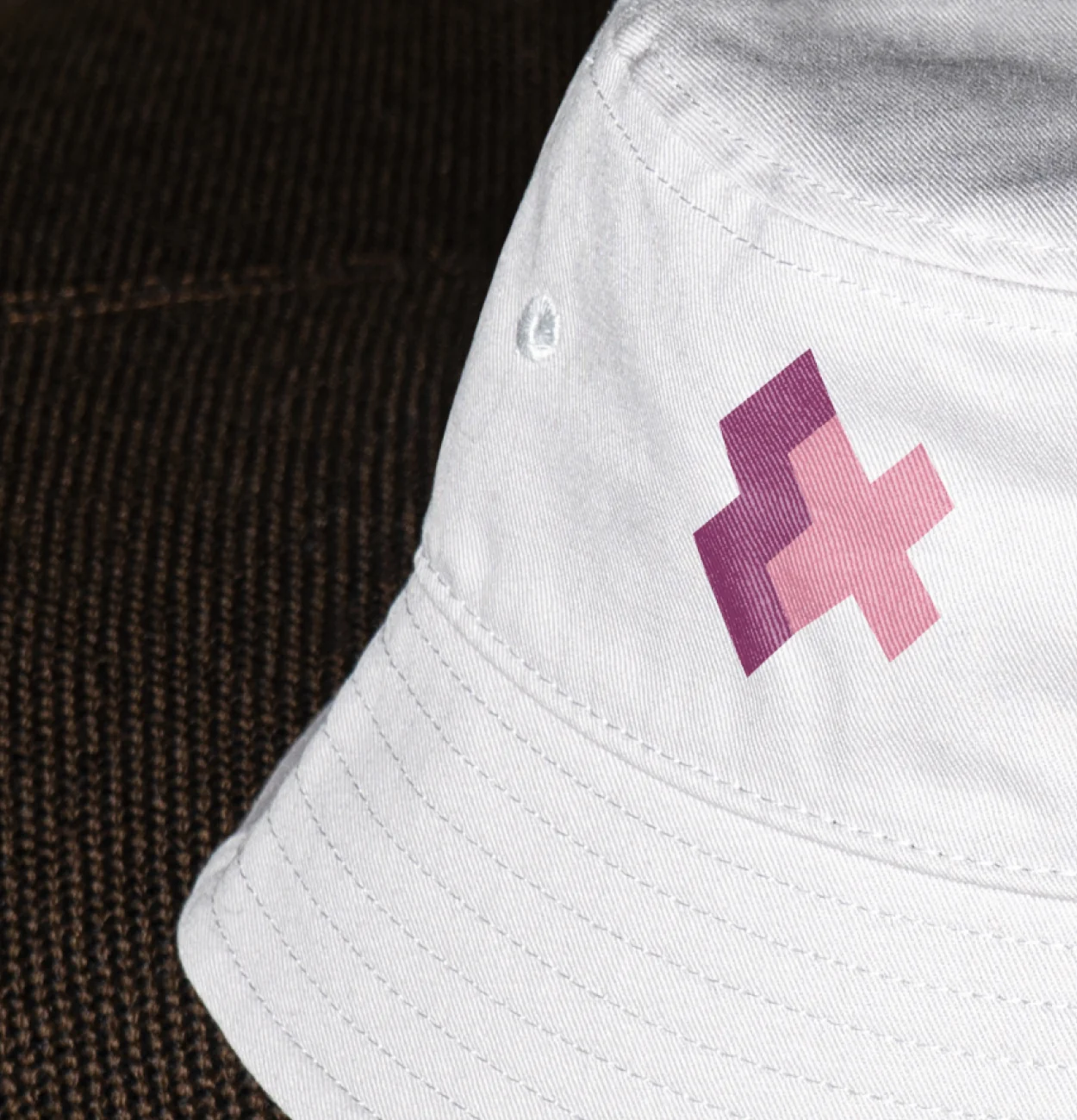
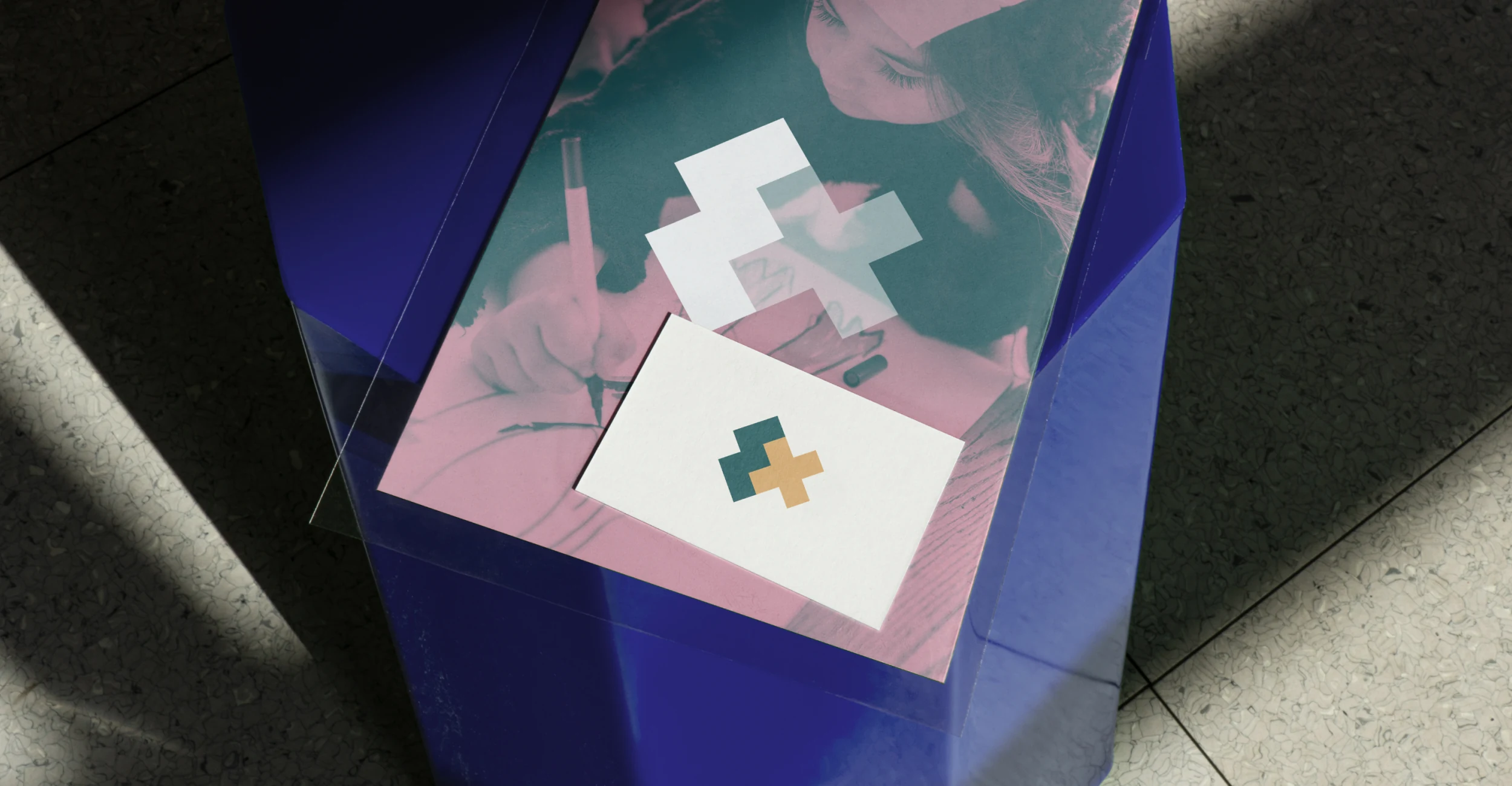
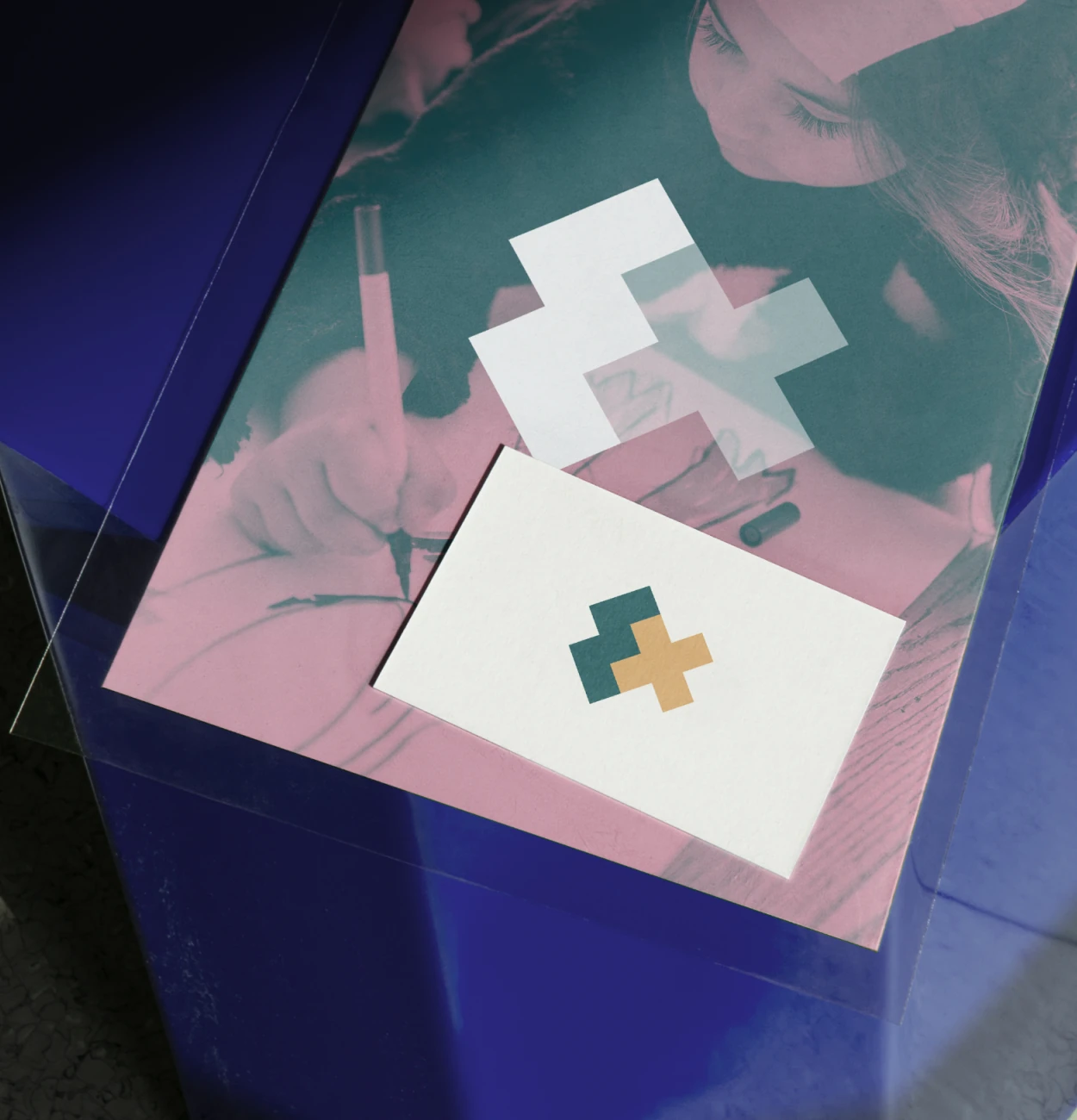
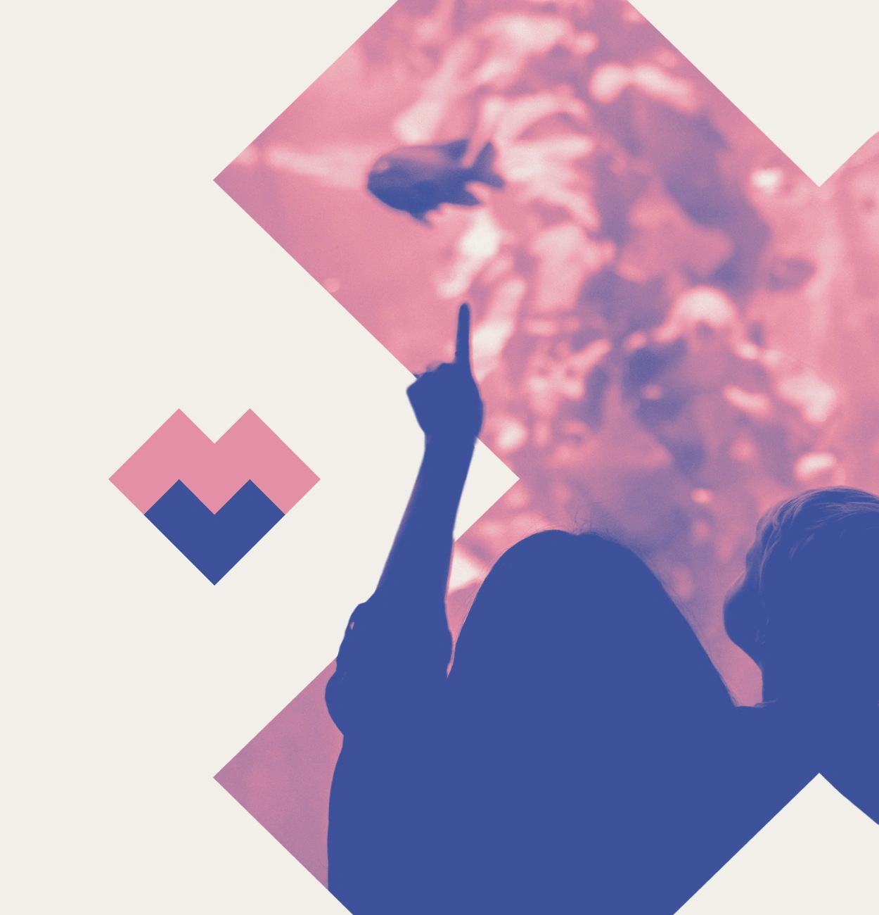
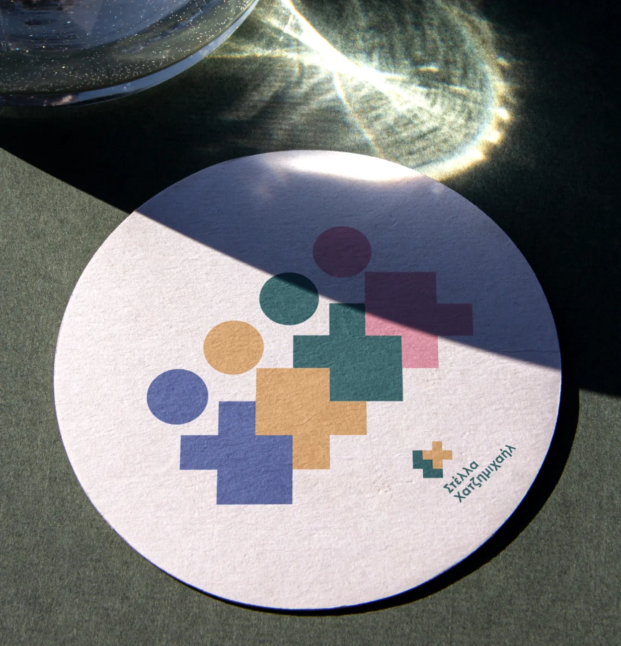
Using inspiration from her Greek initials, specifically the letters ’Σ’ and ’Χ’, we began working on a series of streamlined shapes. Simplifying these characters to their essential forms, we used a streamlined rectangle overlap that was able to be stacked, rotated, and mirrored. In their final, streamlined configuration, they also subtly resemble a fish shape. The form within psychoanalysis that has been often linked with unconscious behaviors and emotions. Similar to the meaning within a therapeutic session that is revealed with the passing time, the logo develops more depth with each subsequent use.
The symbol also recalled puzzle games with children and also tools that Stella frequently utilizes within therapy to assist with patience and to boost self-esteem. That understanding gave a lovely, applicable context to the work, anchoring the visual identity not only within her given name, but within her practice.
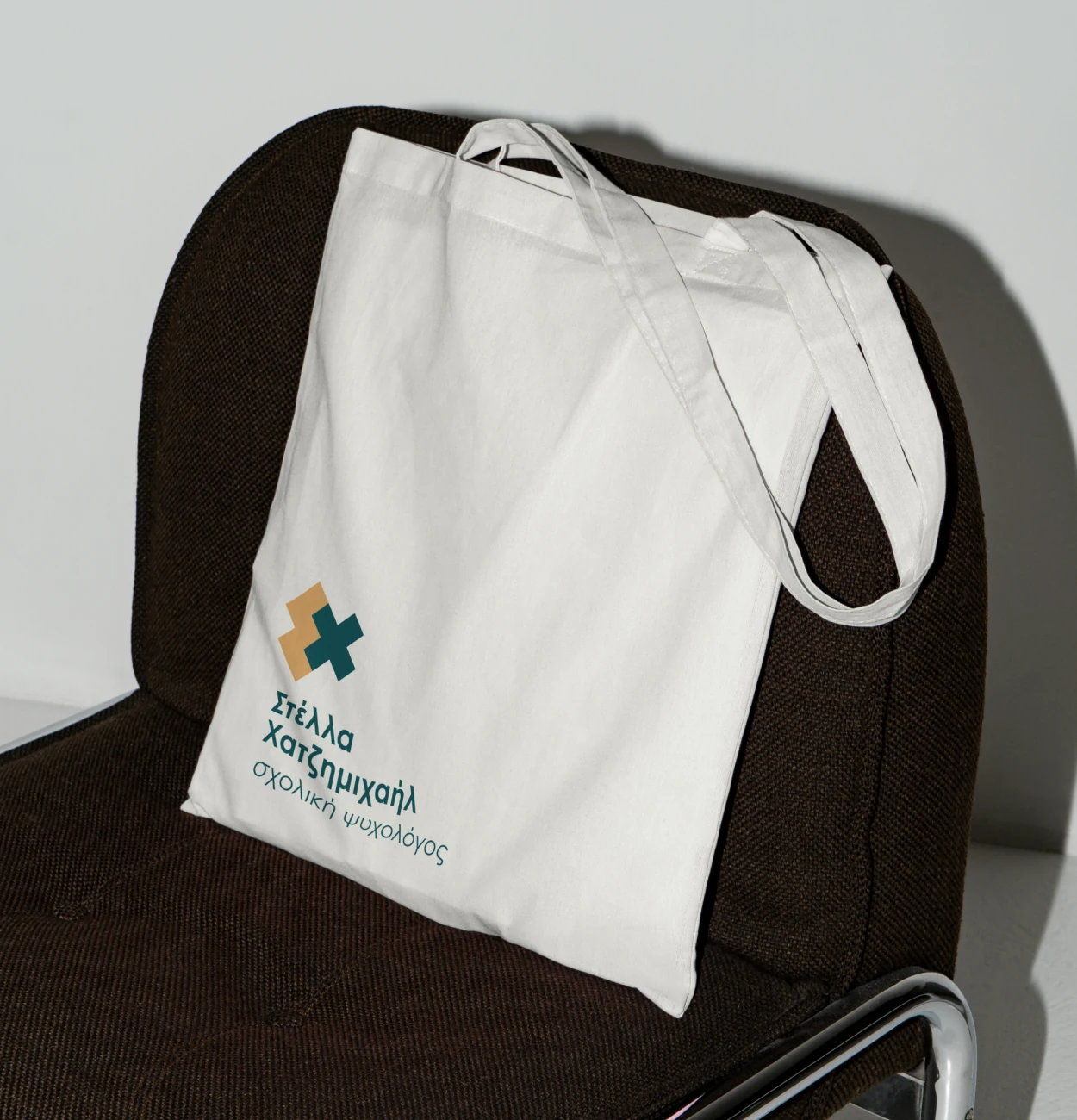
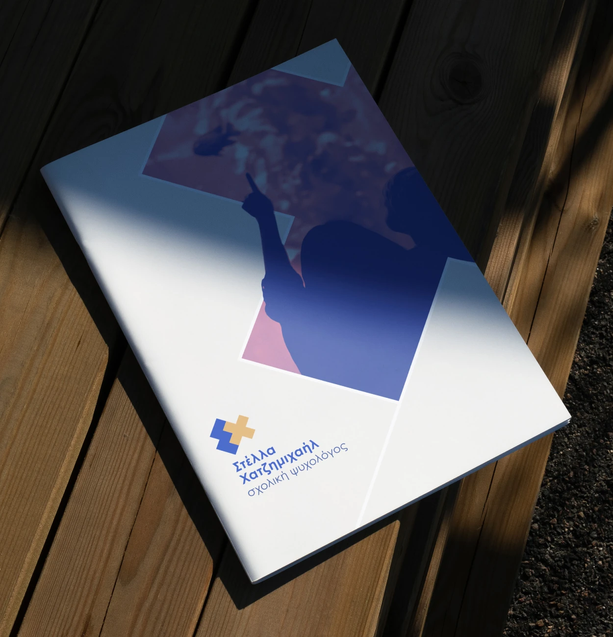
Selecting the final logo was a collaborative process. According to her, the collaboration was “flawless.” We didn’t just submit concepts, but we included her in the reasoning and rationale behind the concepts. These days, Stella’s logo is a soft but confident presence within the community. In a business where trust is the very heart of the matter, and it serves as a reflection of what she does behind the scenes with the children who need her most.


No items found.