Refreshing a movement in a conservative landscape
Athens, Greece
Client
Rainbow School NGO
Mission
Celebrate a decade of social impact and signal a bold new era for Rainbow School as a legally recognized force for inclusive education in Greece.
Outcome
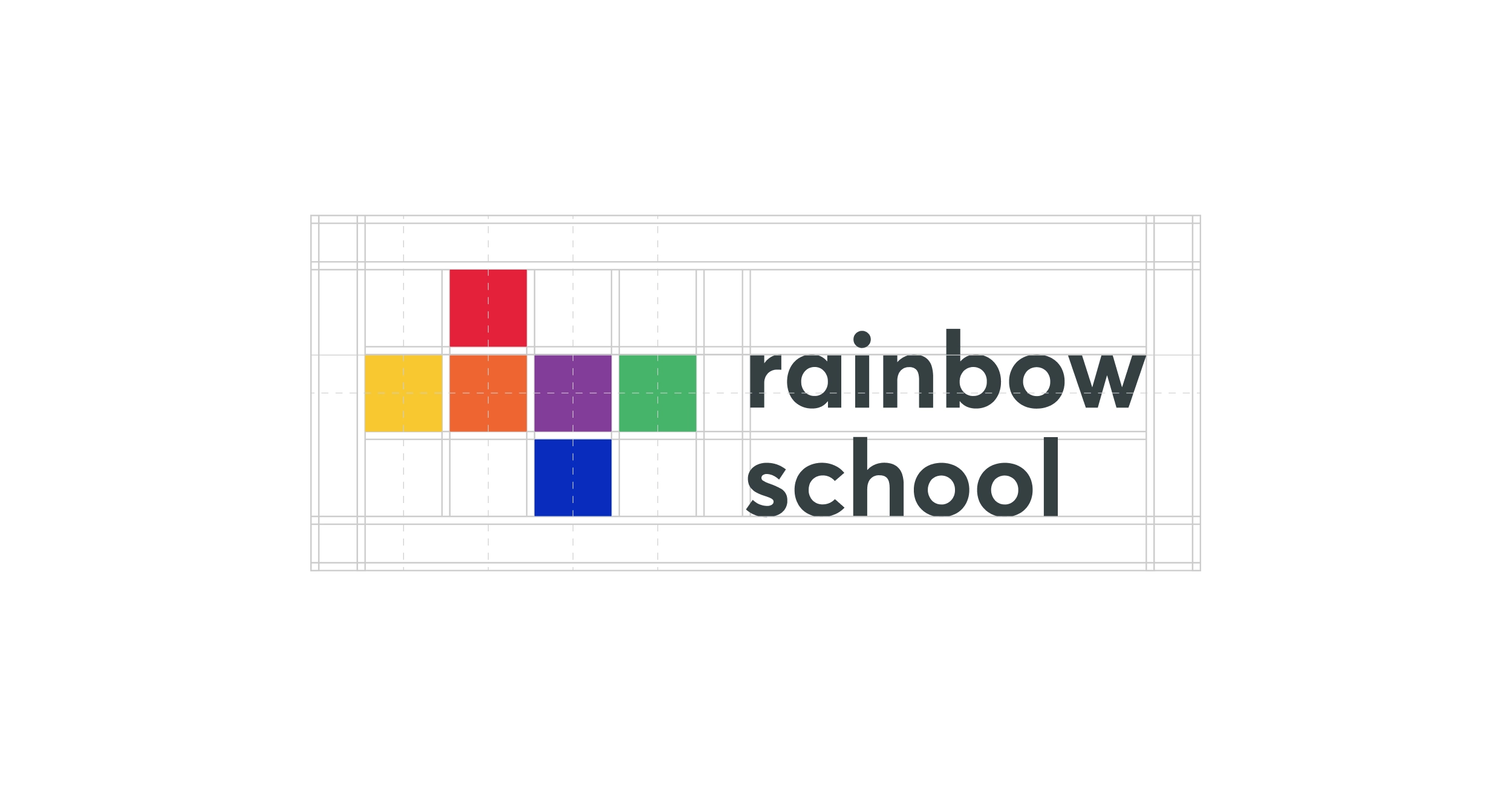
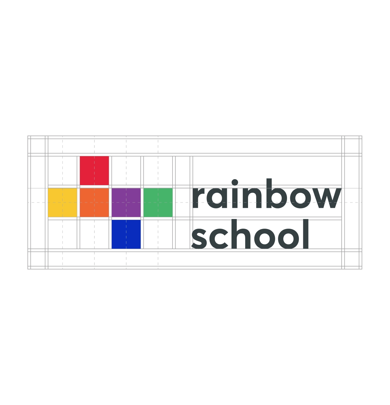
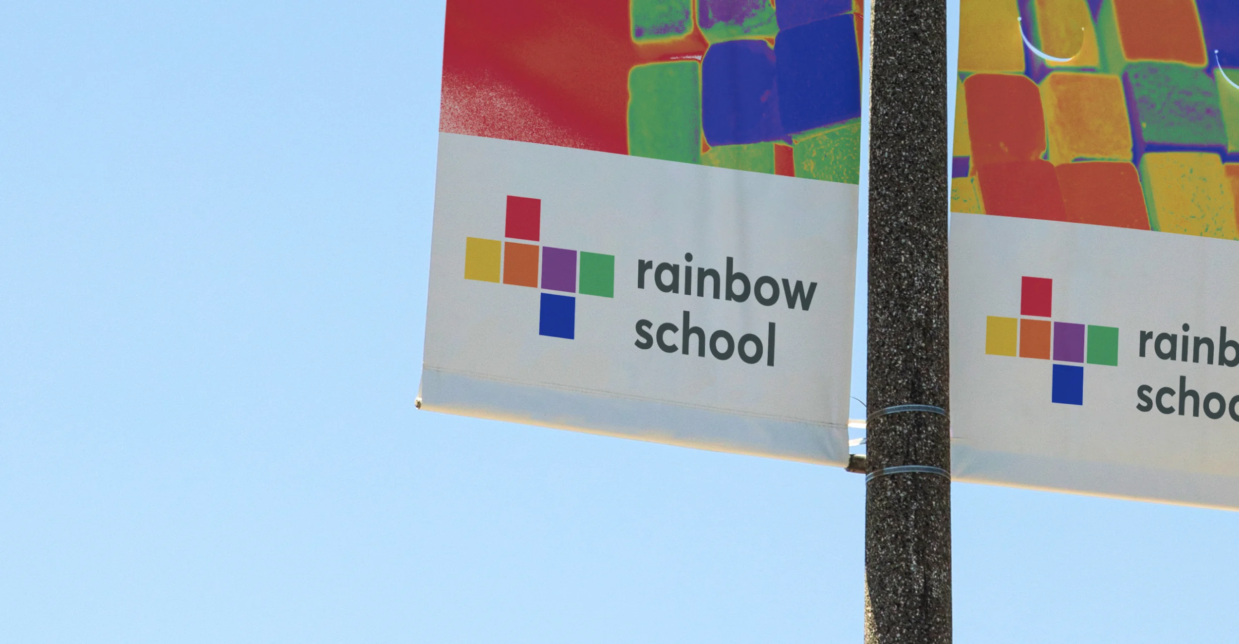
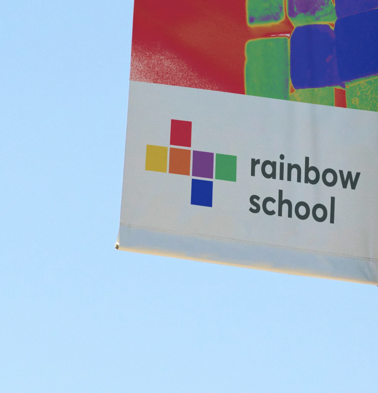
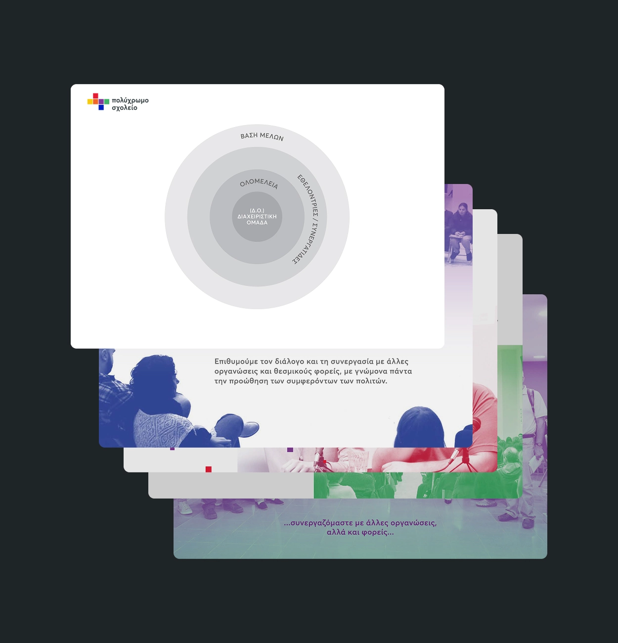
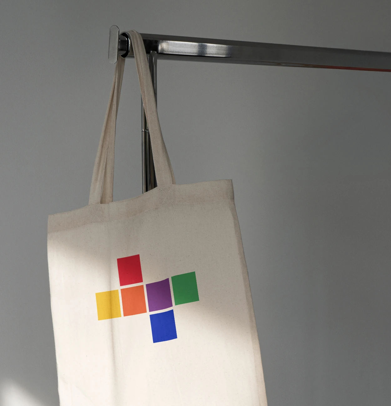
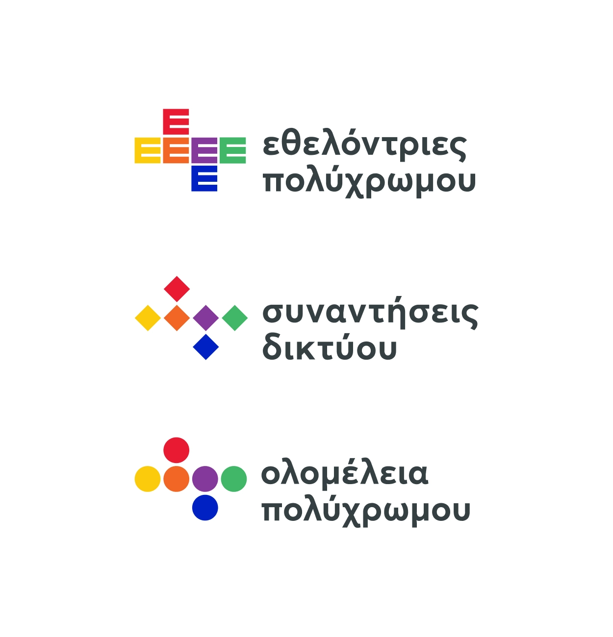
A refreshed brand identity rooted in the symbolism of the cube, representing inclusivity, growth, and the multifaceted nature of identity, developed through a participatory design process with board members.
Impact
The new identity positioned Rainbow School as a credible and professional entity within Greece’s educational and advocacy ecosystems, enabling stronger partnerships and greater policy influence.
Services
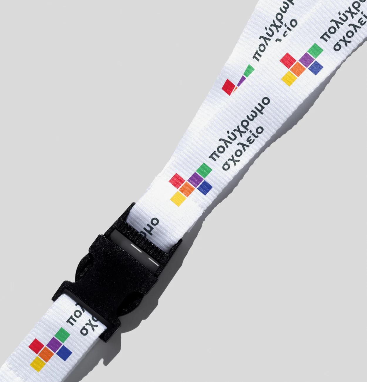
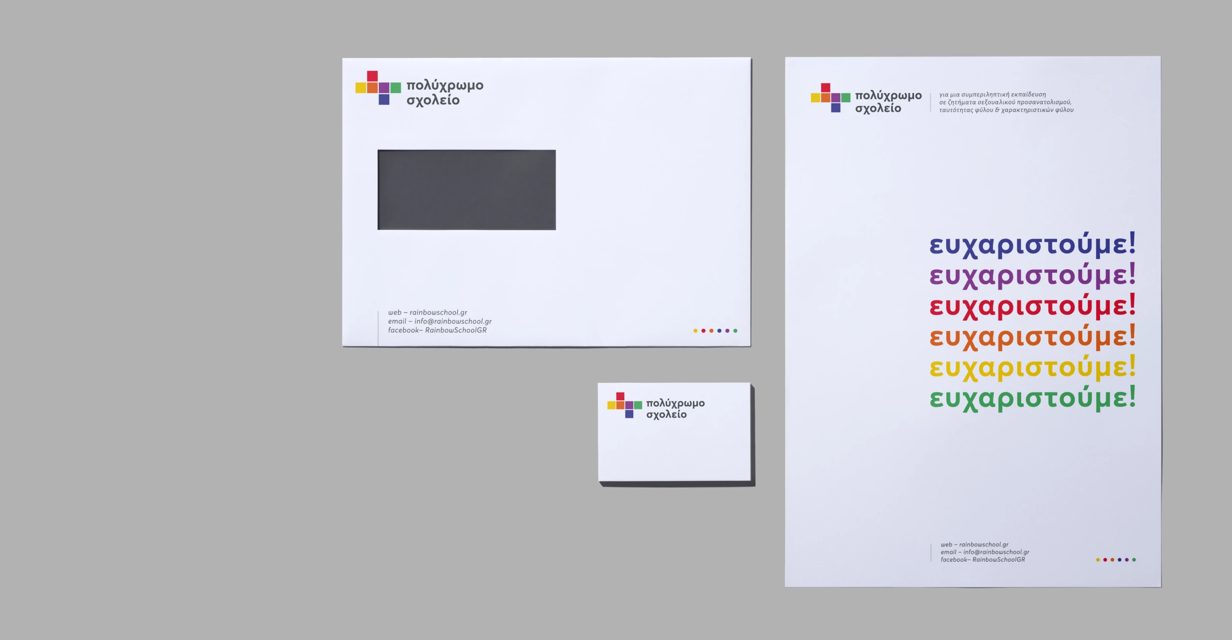
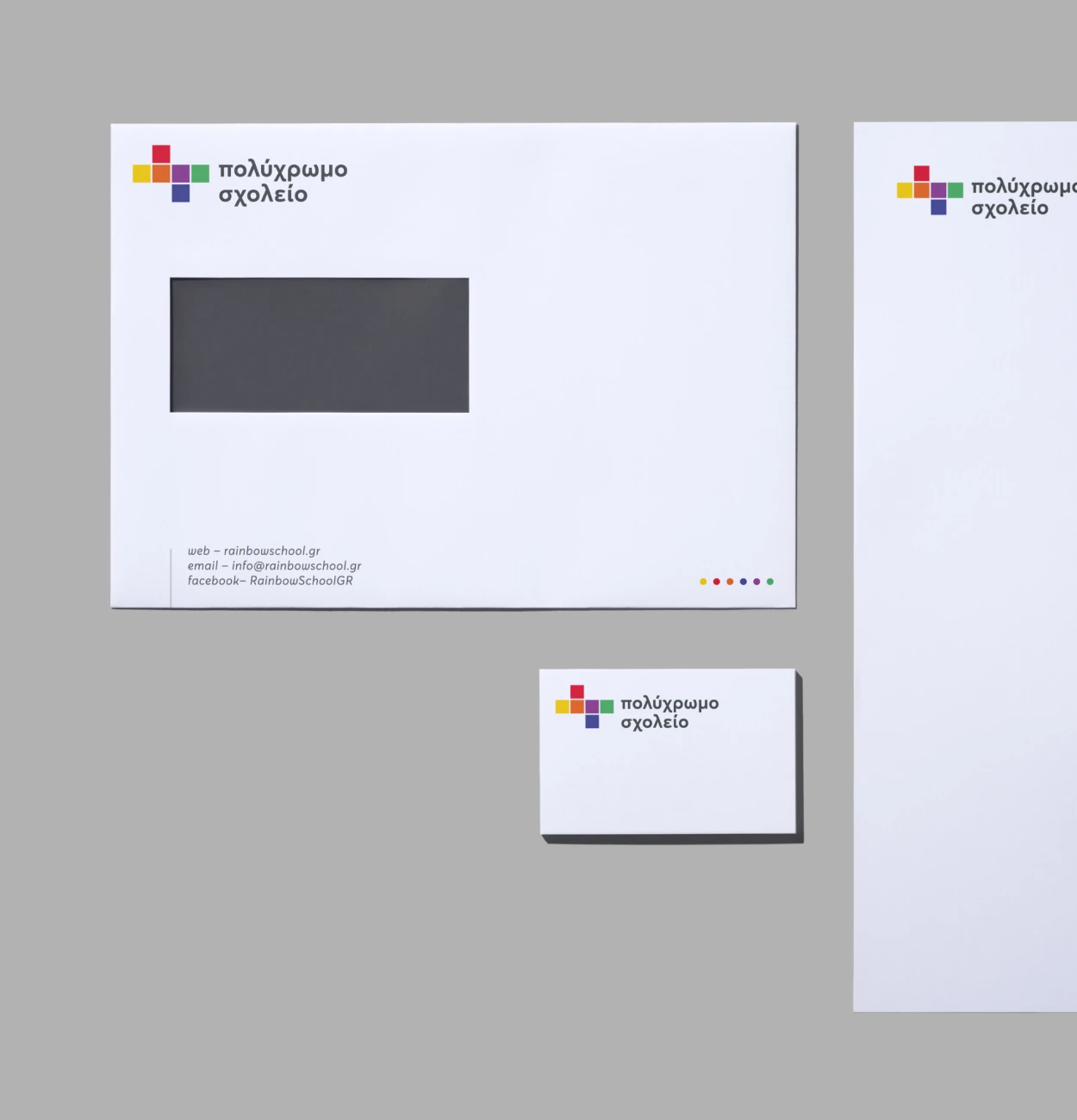
Visual Identity Design, Brand Strategy, Logo Design, Deck Design, Brand Applications, Brand Style Guide, Social Media Templates
In 2009, a group of Greek teachers created a space for LGBT+ teachers to have a sense of solidarity within a school system that did not consistently acknowledge them. Having been formed out of peer solidarity, the initiative then blossomed into a national movement to have greater visibility, inclusion, and policy change. And by the year 2019, Rainbow School was not just an action but it was officially registered as a nonprofit.
The event of a decade provided a timely chance to look back, to reach out, and to refocus. With increasing visibility and institutional presence, Rainbow School needed a brand identity that honored its community-centered beginning but positioned it for the next years. An identity was desired that was meaningful to a broad-based constituency: teachers, students, families, allies, and policymakers.


No items found.
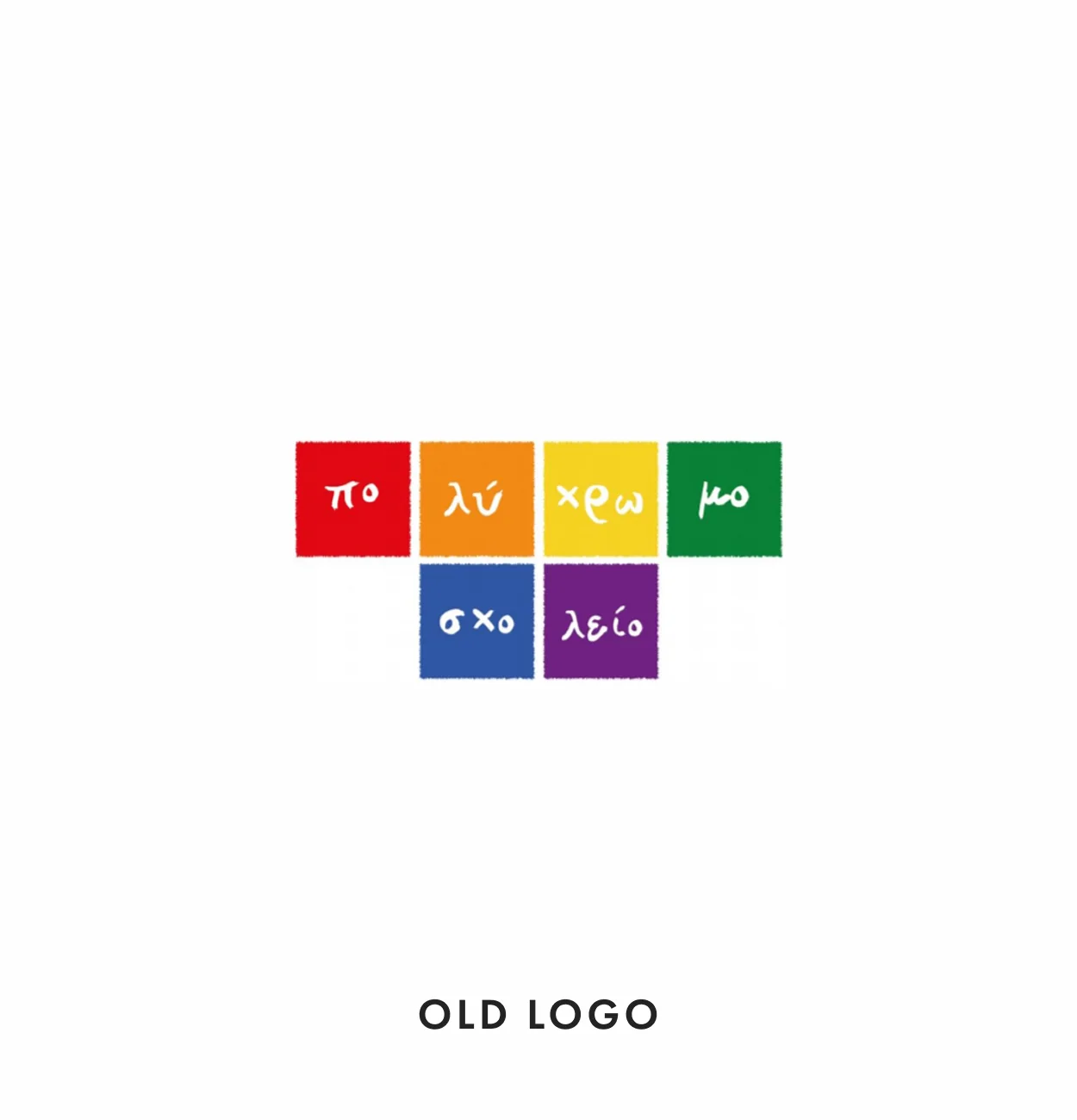
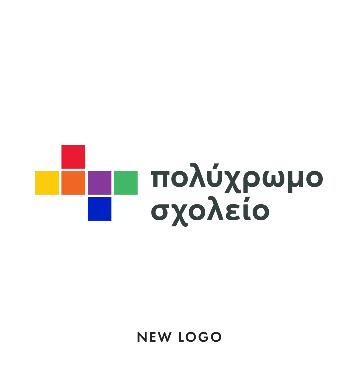
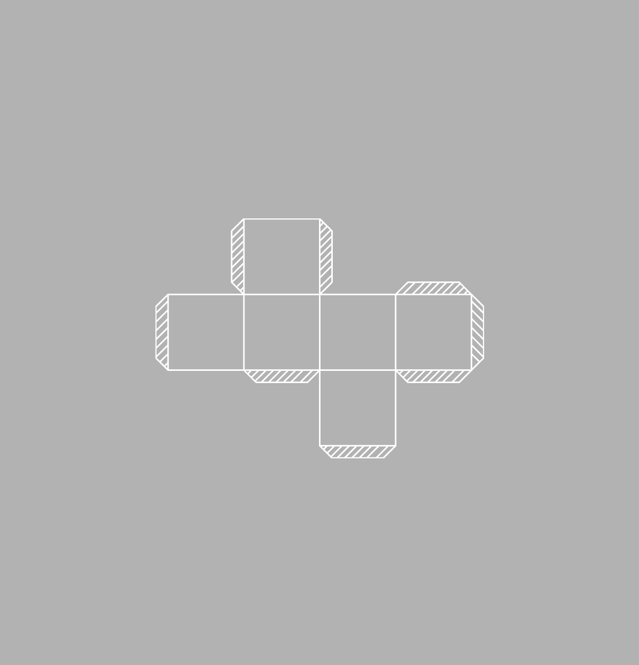
We started with the dieline of a cube, a return to the initial logo. Working with the board, we asked what the cube would represent today. Its imagery came quickly: a shape that includes many sides, such as identity itself. A subtle reference to youth and fun. A shape that is stable and expansive, such as the evolution of the organization. We didn’t discard it. We reimagined it. We tested different cube dielines and we stretched the cube into a more expansive symbol that opens things up. More dimension. More vibrancy.
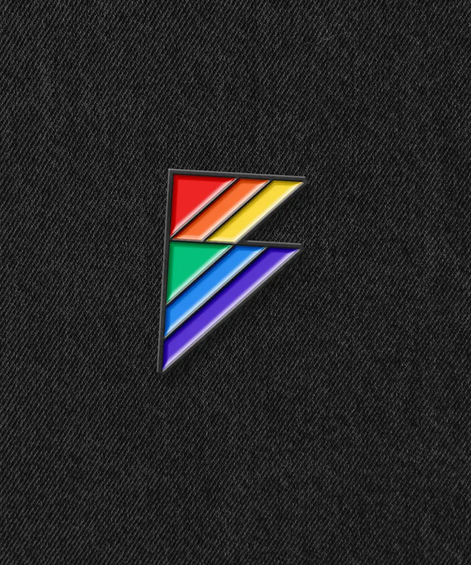
It speaks to curiosity, conversation, and the beautiful richness of the human experience. It’s a cube dieline again but on the move, just as Rainbow School: expanding, stretching, listening, leading. A form that speaks to complexity, that invites to be curious about, that reflects Rainbow School’s dynamic role as a trusted, multi-dimensional voice of change. It’s a signal: this is a safe space to grow, to talk, to change. A gentle but insistent “you belong here.
Unveiled with the decade-long celebration campaign, the new identity achieved consistency to Rainbow School’s expression across materials and moments, within classroom walls and outside, pride marches and conferences. It created new awareness, promoted more internal consistency, and opened a doorway to more substantive discourses about inclusion within schools.

No items found.